Tuesday, 29 November 2011
Monday, 28 November 2011
Fern exploration
ughh tried drawing her in a flatter, wonkier style but its SOOOOO HARDDD FOR MEEEEEE
=__= hence why these aren't very good poses, i'm just trying to understand how to draw her still i guess.
=__= hence why these aren't very good poses, i'm just trying to understand how to draw her still i guess.
Boards and test poses
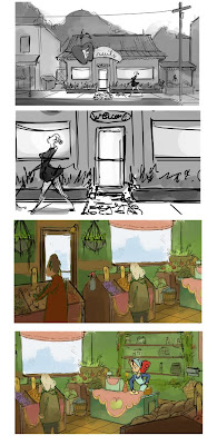
Some test sketches of Fern, just trying to get her character, and coloured her here with her hair like a strawberry lol, and with transparent vs not transparent apron... but yeah, sorry Tanya, the boards are up. :)
Saturday, 26 November 2011
Character Posing and Props
made Fern super tall :s and the first page is just warm up sketches, figuring out how to draw her. thought i would post it in case it could help anyone else draw her. I also painted the fruits and veggies in different styles just to see what direction you guys would like to go in with them.
Thursday, 24 November 2011
Style Proposal Encore
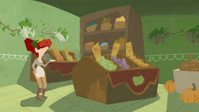
I was trying to go for as stylised as one could go for this one, because our film definitely needs some pizazz. The drawback though, is that it was really hard to do because I never draw in this style.... but it's actually very simple, now. Inspired by Ratatouille, the Coraline Lecture and a little bit of the Warner Bros colouring style.
The background is a touch busy, but I think with our plainly coloured animations, it gives it more interest. As I've noticed some of the films they screen on the second floor have that problem of bland bg, and bland character and totally looking boring.
Wasn't sure how the colour should be so I've got a few slightly different versions
This last one I added a more romantic that DQ showed us last time.
Wednesday, 23 November 2011
Style Proposal 2
 I was inspired more by Warner Brothers this time around. This took around 3 hours to do. I used a construction paper texture to cater to Seema's cut-out styled character design.
Some Notes:
Cast shadows will be used to save composition and does not need to be technically perfect. I figured nobody wants to spend the time to calculate how every shadow works so this would help a lot to save time.
I went nuts on perspective, but I opted to at least keep the sense of space which Maurice Noble has done for his backgrounds.
I've seen Noble use gradients too, but for this time I didn't use them and tried for a flatter style.
Fern and Brimley Shape Design
I thought i would try to boil the characters down to the main shapes that make them up to help us simplify the designs and learn how to draw them with the correct proportions. (well to some degree b/c these aren't THAT accurate!) I saw some work like this in the incredibles book a few weeks back and was dying to try it :)
Labels:
concept,
Design,
Fern,
Inspiration,
rough character design
Monday, 21 November 2011
Chuck Jones Squirrel Film
Hey Guys,
I found that film we were talking about in meeting on Thursday. It's got some neat layouts and colour ideas, especially at the beginning.
I found that film we were talking about in meeting on Thursday. It's got some neat layouts and colour ideas, especially at the beginning.
Sunday, 20 November 2011
Names to Check out for Style Inspiration
Maurice Noble
Warner Bros.
Early Pink Panther Fritz Frieleng
Disney’s sleeping beauty
Walt Stanchfield - drawing for animation
UPA
Saturday, 19 November 2011
Proposals
Everyone's seen these in the meeting but here they are! (btw the second one is completely unfinished but i'll put it up anyways)
Thursday, 17 November 2011
Wednesday, 16 November 2011
Jamila's Swing at Style
Tuesday, 15 November 2011
Style Proposal
shot where Fern sees the spider web
yeahhh its over rendered >.< and (Fern is scary looking) but hopefully we can stylize everything more and simplify more and more as we go along with these!
(also might have come out too dark, my cintiq doesn't quite match up with my mac screen =_=)
yeahhh its over rendered >.< and (Fern is scary looking) but hopefully we can stylize everything more and simplify more and more as we go along with these!
(also might have come out too dark, my cintiq doesn't quite match up with my mac screen =_=)
Monday, 14 November 2011
Boards 1-4
 Some notes:
-Exterior is not close to final design but I didn't think I would be able to get something substantial done in time while juggling with other work.
-I've removed cars from the rough board because I figured nobody (I mean nobody) would want to draw, paint, and/or animate cars lol. Bikes might be the better choice for the sake of everyone's sanity.
Assignment Schedule
*Individual Assignments #1 and #2*
*Group Assignment #1
*Group Assignment #2
*Group Assignment #2 Rubric
Interior Style Pack

 I cleaned up and expanded Kim's rough layout. I noticed this angle worked fantastic for my part of my boards, so this will be storyboard panels 3-4 too.
Some notes:
-I tried colouring the edges so that it's not pure black all the way. Fern is the only one with black edges to stand out amongst the slightly lighter edges around her.
-I watched Seema's link to that fat dude dancing but I noticed the backgrounds were pretty monochrome. If people deem this version to be too complicated and taking away from the main characters, we can shift the colours so they aren't as "rainbow".
-A black and white sans characters version has been attached for people who want to mess with it. I can't draw Fern properly so maybe somebody can place her and the people better than I could.
Sunday, 13 November 2011
More!
This shelf of candies/ jams is supposed to go behind the register, I just forgot to draw it in...
Messed up her arms/hands but I drew her a bit more proportional here. And gave her cinnamon roll hair thing instead of the antenna. What do you guys think? I know I'm having a bit of a hard time getting her on the boards in her current proportion (giant head compared to body) *also added spider for scaleSorry the pic is dark, i took it with my camera. This is just a layout i drew for the cash register area :)
Messed up her arms/hands but I drew her a bit more proportional here. And gave her cinnamon roll hair thing instead of the antenna. What do you guys think? I know I'm having a bit of a hard time getting her on the boards in her current proportion (giant head compared to body) *also added spider for scale
Fruit Containers
 Hey, I thought I would do something for once.
I figured if the place was in Kensington Market, we have to make sure to not make it look TOO clean. Not necessarily saying the colour scheme has to change from what was proposed on the wall but the objects themselves could vary to something more realistic for that marketplace.
Saturday, 12 November 2011
Subscribe to:
Comments (Atom)


